CASE STUDY

User Research


1
Unintuitive website design
2
Poor quality images
3
Cumbersome checkout process


User Persona

Define & Ideate
Value Proposition Statement
Pseudo Crow Co. fashions magnificent horror and romance-inspired masterpieces that embrace the macabre elegance of bygone, contemporary, and forthcoming pop cultures.
USER FLOW

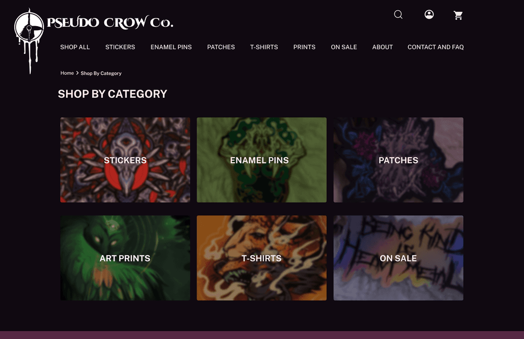
SITE MAP

Design
Branding Moodboard

SKETCHES


Branding Styleguide


Desktop Lo-FI WIREFRAMES

Mobile Lo-FI WIREFRAMES

Usability Testing

FEEDBACK
“Less negative space on About and Checkout Flow on Desktop - looks like it was made on mobile first”
“Long scrolling checkout flow can be overwhelming, try out multiple step process.”
“Carousel CTA button might not be necessary.”
“Too much going on in the mobile top nav.”
A/B Testing
Users preferred a call to action button on the mobile homepage to move forward.


Step by step checkout process was easier for users than the checkout process on one step/page

ITERATIONS
Mobile Header Update


FAQ Copy Hiearchy and Layout